Added feature to Amazon
Enable the color vision deficient consumer make color-informed buys, and bring value to owned items.

STYLE WITH
Amazon is the largest e-commerce business in the world, and as such, it constantly aspires to increase accessibility to serve as many varied user populations as possible. Here, we're concerned with the color-deficient consumer shopping the Amazon fashion category.
Color is an attribute the consumer typically observes with the naked eye, but this poses an obvious challenge for the color-vision challenged consumer who is incapable of effectively evaluating a given product and thereby:
Their shopping experience isn't an inclusive one
Their purchases, overwhelmingly, do not bring value to their wardrobes
Their return rates are higher than the average
Amazon's predictive algorithms are diminished in value because of the consumer's misleading search patterns
Amazon's Try Before You Buy service doesn't deliver consistent value due to this user group’s compromised ability to process and evaluate visual color data.
Amazon Prime has reached out to me to build interventions that drive relevant recommendations to assist the color vision challenged consumer in making informed choices.
Overview

Influence the design narrative to enable an active evaluation of color data by the consumer with color deficient vision to facilitate informed buys. The primary focus is strategizing to make color data accessible for the color-vision challenged consumer, and reframe the recommendation narrative for greater precision. The design modification should be infinitely scalable, and it should make complete use of Amazon's current repository of designs with minimized creation of new entities.
Design Objective

Design is for the people, and thus, it should be accessible to as many people as possible, including the 500,000,000+ individuals with visual challenges. It's apparent that we need to leverage design language that's inclusive, and provide relevant information to the consumer. The better informed the consumer, the greater their satisfaction, and the greater our retention rate. Amazon's current color data doesn't effectively inform consumers with color-deficient vision, and so the return rate within this population can be as high as 80%. This, in turn, impacts smaller businesses and impedes their success on the Amazon platform.
Why is this important for design?
Functional features of the solution

Though the QR codes contains the color data I've also included the color name and a 4-digit code across all product data on the Amazon site.
Shoppers can be informed on the colors of recommendations and buys
Enable an informed exploration with new colors
Keep the buys in each colors balanced; diversify wardrobe looks and colors
Increase buys in colors and silhouettes user are comfortable with and complimented on
I've settled on using a reduced return rate from the consumer with color deficient visions to indicate feature success. This feature will be implemented for the Desktop since the majority of shoppers (67%) still use their computers to engage with Amazon.
I ensured the design solution neatly integrates with Amazon's existing design language, information architecture, and user flows. New components followed established design rules. The solution is sound and grows richer and stronger with the addition of products.
I am linking the product identity with unique and dynamic QR codes, each of which is capable of containing multiple URLS, and exchanging 7000 characters of data. As Amazon retains users purchase history integrating a unique QR code with product:
Automates searches for recommendations coordinating with previous retained purchases
Creates a relevant color/style profile

Experience design high level goals
-
. Declutter information, label color fields with text descriptors in crayon parlance
. Provide toggles for options in contrast & view modes
. Provide additional photography in suggested best practices
-
. Feature UI is compliant with the Amazon look and function
. Explicitly explain the relevance of items recommended
-
. Visual presentation of text and images have a contrast ratio of at least 7:1
. Visual presentation of large text has a contrast ratio of at least 3:1
. Text should not overlap, be clipped, truncated or obscured
. Linked in-line text is clearly identifiable from body text
. Typefaces are legible and characters have distinct features from one another

Design process
Usability testing, Insights, Prioritized revisions, Learnings, Next steps
User needs and secondary research helped identify the touch points of frustration and the benchmarks of design evolution. Research data was also used to generate a user persona which lent direction to user flows and prioritization of features. An exercise in visual design was followed with wireframes and prototypes. High fidelity prototypes were tested to evaluate design solutions for success. I encapsulated my learnings from this exercise for the next set of iterations, improvements, and prioritized revisions. Deliverables that helped isolate the solution process are as listed below:
Empathize
Define
Competitor research, User interviews, Persona
Feature roadmap, Feature prioritization, Business and user goals, Flows
Ideate
Mock ups, High fidelity wireframes
Prototype
High fidelity prototype
Validation

Timeline
February 2022
My Role
UX/UI Design
Team
Solo Project
Tools
Sketch, Google Suite, YouTube
Empathize
Competitive analysis

I explored solutions for the color vision challenged consumer on Amazon and other fashion websites; it's clear that none of the available answers are truly effective. There isn't alternate information that can make color a useful piece of information for consumers unable to process it visually.
Competitive research learnings
Operating systems like Microsoft and MacOS feature enhanced contrast/increased text legibility to increase accessibility. Such settings strive to cater towards a general attempt to cover multiple variants of vision deficiency. MacOS also includes a small set of preset colors that can be selected for specific CVD variants, but notably, there isn't any existing feature to enable a correct evaluation of color as needed for the fashion shopper with CVD.
Outfit generators and virtual assistance apps; didn't effectively solve the problem either. For example, Stylebook's marketing strives for automation of the wardrobe selection process, but in truth, they provide little more than a database that requires user maintenance and normal vision.
I reviewed Amazon’s Style Snap app to explore its features and design patterns. Style Snap is able to identify colors, edges and patterns from uploaded images of outfits, however, the color data is visual and lacks supporting text descriptors.
Style Snap proves disappointing in that it does not retain a record of purchases, and its recommendations do not account for currently owned items.


I interviewed two color-vision challenged consumers, both female and between 50-55 years old. We discussed their experiences of struggling to relate to color when making purchase decisions. One participant had moderately impacted color vision, and the other had severely deficient color vision.
-
. Reds and greens blended together.
. Difficulty distinguishing between darker colors on dark backgrounds.
. Difficulty differentiating between different hues of colors like yellows, purples, pinks
. Difficulty interpreting the color of small text and thin lines
. Darker shades of red and green are harder to disambiguate
. The distinction between more hues is muddied
. Can distinguish alternative or high contrast colors better
. Hues and shades fuse and patterns lose form
-
. Unable to identify colors and patterns that speak to their personality
. Color descriptors lack crayon parlance and this makes associations difficult
. Unable to identify value buys that bring multiple looks to the closet
. Dependent on friends and family when shopping and organizing the closet
. Low contrast visuals & cluttered visuals
. Text links and alerts called out in colors go unnoticed
-
. Color readers to identify colors of objects
. Add stickers to identify shoes
. Using specific organization methods
. Remembering and Identifying item colors by texture
-
. Pages are crowded and descriptions are not a quick visual scan
. The shop now CTA fails its function as it fades into the background
. Photography lacks dimension; zoom helps but images gets cropped
. Color swatches on product(s) pages are not labeled with color names
User Interview Synthesis
User persona

40% of the 300,000 color-vision challenged women in the US are between 50-69 years old. They are typically interested in their appearances, and have the means to buy many goods and services.
An extremely conservative calculator indicates that the expenditure of this demographic towards apparel and accessories is $2 billion per annum.
Demographics & buying power
I conducted an analysis of Amazon's UX/UI design choices to develop an understanding of their design language, and discover the strengths and weaknesses of the existing experience. This enabled me to confidently make UX/UI decisions as if I were working on the Amazon design team and leading the roll-out of this feature.
Analysis of Amazon’s UXUI
Design Change #1
My research has established that decluttering and compartmentalizing are both critical user needs. Here this can be accomplished by tucking away the “Description and Key Feature” sections under a link. This change enables a consistent and visually appealing presentation for the consumer.
Amazon’s Product Page
My analysis of several product pages reveals that the “Description” and “Key Features” sections can vary from being a few lines to a full page long, often with run-on content that fails to provide any actual value to the consumer.
Currently, the contrast ratio for the CTA button, the gray and green text holders, and CTA text (font weight and size) fail WCAG compliance standards.

Design Change #2
Color contrast is a strong visual cue, draws attention, and assists in orienting users. Increasing font size and color contrast will make it easier for the consumer to visually inspect the content.
Amazon’s CTA Contrast & Text Size
Colors and prints are displayed as color swatches, they are not supported with text descriptors. However supporting this visual information with generic text descriptors will not assist the color vision challenged shopper in coordinating shades and hues; this suggests that the solution for CVD shopper would require recommendations relevant to owned items.

Design Change #3
My solution will recommend the singular most relevant color per style, and state the number of looks it adds to the wardrobe. To ensure that the user does not feel limited Alexa will be introduced into the solution dialogue to assist users with exploring and adding additional colors to their wardrobes.

Color Data on Product Page
Once consumers become paying Amazon Prime members, they tend to strive towards making the most of their subscription. Shopping sprees begin at their personalized homepage and over time, this homepage becomes interwoven with Amazon’s identity.
I noticed the UI across different features pages was inconsistent, right down to the inconsistency in font style and size and the style of images used. This inconsistency served as a significant challenge in isolating relevant patterns for my feature.

Amazon feature pages
The final solution that presented itself after a detailing of business user needs and WCAG requirements (feature prioritization) called for the products to communicate with owned items and present themselves as recommendations only if relevant. This would facilitate a truly inclusive shopping experience, and reduce return rates while preserving Amazon design patterns.
Define
Enabling the customers purchase history with the power to coordinate looks.
Dynamic QR codes can contain multiple URLs, and hold/exchange up to 7000 characters of data. I integrated such a unique QR code within the product identity. This enables the consumer's purchase history to shape relevant color and style profiles, shop the Amazon platform for fashion items which coordinate with previous Amazon purchases, and brings these recommendations to the consumer. Each new look a purchase brings to the closet is illustrated with mood boards.
Enabling users to pull coordinated looks from owned items.
Though the QR codes contains the color data I've also included the color name and a 4-digit code across all product data on the Amazon site. Shoppers can be informed on the colors of buys, pull from the wardrobe with ease when dressing up with the help of mood boards, increase their exploration with new colors after they are made comfortable with this recommendation system which never fails them.
Solution feature attributes user needs to engage with
I was undecided on the touchpoint I would initiate the visual discussion of the QR Code and the Color Code. The QR code is product information used by algorithms to power recommendations and its visual presence in the design buildout is no more relevant than displaying a piece of code. However, Amazon recommendations had been failing my user base; and I would need to regain their trust by engaging them with the logic that drives this automation. I decided to detail the solution on the feature page with the color code only and introduced the visual of the QR code at the checkout page.
Solution
I scoped the problem for business, users, and technology, translated this into an actionable features roadmap, prioritized features and finally created a user flow. Use of established design patterns, common interactions and native components; familiarity and consistency would give users a head start.

Business User Needs
Features to make visual color information accessible for the color-deficient consumer are the most obvious endeavor to be prioritized. To do so, WCAG guidelines for fonts, colors and design patterns will define the standards for accessibility in this build-out and provide a UI more relevant for the visually challenged user.
-
. Enable option to switch from light and dark mode within the feature
. Text and images text contrast ratio of at least 7:1
. Large text contrast ratio of at least 3:1
. Primary & Secondary CTA
. Enable option to switch from dark to light mode
-
. Typefaces are legible and characters have distinct features from one another
. Use precise language, such as verbs on button tiles, “continue,” instead of “yes” and “no” options
. Large bodies of text are left-aligned
. Line lengths are close to 66 characters
-
. Open and close side menu with.a toggle feature; increases the spacing in the product(s) grid layout and is an easy visual scan
-
. Linked in-line text is clearly identifiable from body text
. Ensure text links stand out by using a clear callout, such as an underline
. Provide enough white space around click and tap targets
-
. Enable informed purchases; use text labels / descriptors for colors to ensure users have a knowledge of what they are looking at.
-
. Use of purchase history for future recommendations
. Automate mood boards for all looks a recommendation creates with owned items
. Include option to buy on all product view screens
. Used established design patterns, common interactions and native components; familiarity and consistency gave users a head start
. Use focused photography; increase product image size.
. Build out a solution with images - not textual justifications
Features Roadmap
Ideate
Low fidelity wireframes
My first deliverable here was a low fidelity product(s) homepage. This was the touchpoint for the feature addition.
My choice in design overcompensated in justifying an AI generated solution and, had the visual appeal of a raw database. I had additionally changed Amazon’s Product(s) grid into a list format, the size of the product image was overshadowed by excessive text, it did not look like Amazon any longer.
I had not added a feature, I had destroyed the Amazon UI. I did like the relevance of selecting by Style/Occasion, however this filtering was also not relevant to the Amazon platform. I decided to stay true to Amazon’s product page and this was my last exercise in low fidelity.

Here I have tried a wide variety of UI and content designs to communicate the value of recommendations that create interchangeable looks, layer up for different seasons and transition from AM-PM. I started with “The Collage” - a clutter that spoke to my color sighted aesthetics. I next filtered it through the lens of my “design must haves” and the decluttered and vibrant images of “Say it with a moodboard” emerged as part of the solution process.
Visual design
-
![]()
Buys for all seasons
Here I am calling out the value by buys that layer up from summer through winter.
-
![]()
Casual to trendy
The value is conveyed by interchangeable pieces that create multiple outfits.


I trialed multiple options of product visuals for the STYLE WITH feature page. I decided to move onward with the mood board feel where recommendations also showcased owned items - all neatly labelled. However, it did not look very neat.
Excessive labeling and busy backgrounds made for a cluttered and messy presentation; they weren’t working.
High fidelity design
Feature page iterations


Cluttered and busy visuals with labels were eliminated from the design paradigm. A relevant image and an uncluttered mood board helped define my feature for my user. I detailed the recommendation strategy, added sustainability to the solution and modeled STYLE WITH as a purpose driven venture, and Amazon as a catalyst for system-level change.

STYLE WITH feature page
To the left is Amazon’s side-menu. I made the necessary corrections to ensure it complied to WCAG standards and spoke to established user needs.

WCAG Compliant UI
Side menu
Increased font size and spacing
Decluttered by tucking away category options
Made color data accessible
Preselected size data from profile
Allowed the selection of multiple sub-categories & color options
Increased padding around click and tap targets
Built a toggle to switch between dark and light mode
Offered the choice of shopping cruelty free apparel
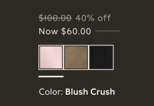
The color data on Amazon’s product(s) page (far left) is mainly visual. As already discussed adding descriptors will not help the CVD user with making buys that add value to owned items. To ensure value buys:
I have recommended only one color and stated the number of new looks it brings to owned items
Used focused photography and captured image details
Employed varying font sizes, weights and spacing to call out relevant information
Enabled option to toggle between dark and light mode

Accessible color data
Amazon’s Prime Try Before You Buy purchases have their own cart and a separate checkout process. When users go over the allocated budget they return items. 49% of people abandon their shopping cart because extra costs at checkout were too high. If a user checks out carts separately the possibility of one cart being abandoned is higher; having all items in the same cart allows STYLE WITH items an equal and informed consideration at checkout. Therefore I have created a one step checkout by:


Consolidating items to a single cart
Categorizing items as per terms of sale
Accepting payment for Amazon Prime items
Informing shopper of their future commitments on Try Before You Buy & STYLE WITH items.
The convenience of shipping to multiple addresses.
I have also included the visual of the QR code in the checkout process to reassure the customer of color coordinated recommendations.
Consolidated checkout cart
Select High Fidelity Screens
-
![]()
Redesigned Prime Try Before You Buy Page
-
![]()
Clothing, Shoes and Jewelry recommendations with sidebar in dark mode


I created two distinct testing scenarios: the first to evaluate the contribution of different contrast modes towards increasing visual ease. The second scenario tested the consumer's journey and the contribution of my changes in informing visual color data.
Prototype
Scenario 1
Evaluates the user experience with a decluttered look with multiple options of contrast and views.
Scenario 2
Evaluate user engagement with flows, the relative ease of comprehension of color data in comparison to Amazon’s model, and their response to the changes in the checkout process.
Number or participants 2
Average age 45
Gender Female
Marital Status Equal representation of married and divorce
Children 50% of the participants have children
Pets None
Annual Income $400K
Spending Habits Cultural
Product familiarity Ardent Amazon shoppers
TESTING
Demographics
Successful task completion by 100% of the user group
Information is easy to recognize and understand which increases accessibility
The solution is relieving, the shopping and checkout process are pleasurable
Mood boards elicit a positive response
Criteria for success
Test Results
-
Both the participants were able to complete the two test scenarios. They moved through the task effortlessly and expressed relief over the well-guided shopping experience, and horror over the manufacturing process of silk. The slogan alongside Amazon’s smile logo, “giving the environment a reason to smile," brought a smile to their face.
-
The header image was not clear in explaining the feature.
-
The user would like to see:
Fabric details in the product description grid
A 360 degree view of the item in the product(s) page to evaluate finer details.
The size was pre-checked and this raised a relevant question, “does the recommendation engine check specifications from different brands to help find the right size?”
-
Users would like to experience the build out for the Alexa feature and expand on their wardrobe with new colors.
-
Test participants suggested building a link in the main navigation for access to mood boards.
They also expressed the need for allowing substitutions, and the option to remove an item from recommendations and mood boards.
I believed this would mislead the AI generated profile as users were unable to evaluate color.
-
Users found it is efficient to have just one cart and the absence of the Try Before You cart was received as a welcome simplification in checking out.
It was convenient to view shipping and handling for all items in cart.
Feature introduction page
I changed the header image on feature page for one that illustrated the features function and value.

Product(s) page
Updated item description to include fabric content and built in options for a panoramic view.

Moodboards
Made mood boards more dynamic, allowed a relevant substitution of items to allow control - never know what’s in the laundry!

Added a navigation category
The Amazon navigation is dynamic and its categories change to be relevant to user searches and functions called upon. I replaced “Favorite Categories” with “My Moodboards.” Users who shopped STYLE WITH will have this category in their menu bar.

Priority design changes
Learnings
-
Expressing preferences by making choices reinforces the perception of control when choices have desired outcomes. However, the perceived value of choice is diminished if the result fails to deliver desired value. The consumer with color-challenged vision consistently fails to achieve optimal satisfaction when exercising independent choice. It seemed apparent that an optimized recommendation would then bring maximum satisfaction to these consumers. My test participants were absolutely overjoyed with this solution that enabled them to make coordinated wardrobe choices with relative ease.
I learnt there’s an interesting balance to strike between providing choices, and creating choice overload that then causes mental fatigue. This presents choice as a fascinating paradox where excess choice can detract from the value of choice as a vehicle for perceived control, expression, and assertion.
-
Much of our behavior is elicited by environmental cues; it is possible that test participants desired the experiences Stylebook delivers to their color sighted
-
While QR codes are a potential threat to privacy, positive feedback in user testing indicates this potential threat is an acceptable price to pay in exchange for effortless and coordinated dressing for my user group.
Though I added the “My Mood boards” category to the navigation bar, the feature has yet to be built out. In addition I would like to allow users the option of creating mood boards, while guiding their choices with multiple recommendations guided by owned buys.
In a future scenario, I would also build out the Alexa feature, primarily to inspire user confidence in my recommendations and also to expand on wardrobe colors while retaining value. Lastly, I would provide three color options in each style; the conflict created by choice is a lesser evil than a perceived loss of control.
Next steps
A solution that evolved into a data strategy
This recommendation algorithm can be pulled to automate or optimize the functions of Amazon Stylists and Personal Shoppers, and also help vendors make informed projections. The increased accessibility with a reframed design narrative will also empower AWS (the second largest search engine in the world) with a reorganized body of knowledge and enable the building of inclusive websites and web applications.
