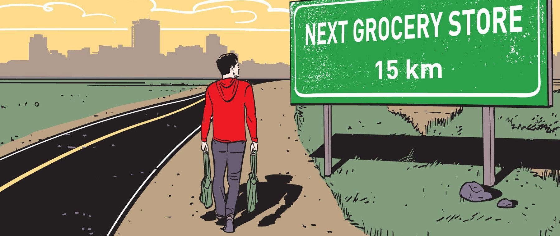
Enabling food justice and ending waste, consuming locally grown ugly produce
eating aware
Sponsored for participation in the ReFED Food Waste Solutions Summit 2022
Responsive Web Design
Overview
ReFED, a national nonprofit working to end food waste across the U.S. food system seeks a donation matching digital solution to end food inequity in food deserts and facilitate ease of access to fresh produce irrespective of economic barriers. They believe resilient and inclusive communities can leverage collective action to end food waste and food inequity.
This case study is best viewed on desktop

Food Deserts" remain big problem in more than 2 dozen New York City neighborhoods
BY LISA ROZNER
JUNE 13, 2022 / 11:51 PM / CBS NEW YORK
Though Misfits Market claims they will end food apartheid and eliminate food deserts by 2025, their website design does not empower residents in food deserts free access to produce. 1 out 8 Americans in food deserts remain food insecure; and Misfits claims have not changed these statistics for the better.

How is the problem relevant for design?
Timeline
September 2021
My Role
UX/UI Design
Team
Solo Project
Tools
Sketch, Google Suite, YouTube

Objective
-

Create
Responsive website with strong visual appeal and content that authenticates the mission statement of food justice, creates the ideal purchase moment experience, offers transparency and is easy to use
-

Influence
Engage with users to leverage sentiments on sustainability towards ending food equity. Influence participation in a buy one give one produce box model that ends hunger within communities
-

Facilitate
End nutritional deprivation in food deserts. Facilitate online ordering and doorstep delivery of produce irrespective of economic status. Make giving easier and design to increase transparency
-

Validate
Content, features and flow prove to be relevant in educating users on existing food inequity, and transparency of solution invites trust and converts consumers.

High Level Design Goals
-
![]()
Responsive.
Responsive, colorful & trendy; strong branding supporting food justice.
-
![]()
Relevant.
Speak to user needs, resolve pain points experienced at competitor website.


-
Primary & Secondary Research
Competitive Analysis
User Interviews
Persona
-
Business + User Needs
Features Roadmap
Sitemap
User Flows
-
Wireframing
Branding & Visual Design
-
Usability Testing & Validation
-
Design Iterations
Learnings
Next Steps
Design Process

Empathize
I checked Google Trends for the most researched imperfect produce box services and the three indirect competitors identified were Misfits Market, Imperfect Foods and Hungry Harvest. I conducted a detailed comparative analyses to:
Gain familiarity with features offered, and flows
Analyze the strengths and weaknesses in reference to addressing food inequity
Identify branding elements that help leverage the value in a story of social justice, and create product associations relevant to user expectation
Evaluate site for visual appeal, transparency, ease of use & quick checkout
Identify preliminary personas
Evaluate business model for delivery on implied guarantees

Competitive Analysis
In many urban neighborhoods, it’s easier to buy a pint of liquor or a gun than a fresh tomato.

Tracks preferences and customizes recommendations
Introductory discount & discount for SNAP recipients in COVID
Competitive Research Learnings
Design fails in delivering a structured and transparent solution for food equity; assistance extended is highly random, surely not a regular and committed effort that can assist families in escaping the clutches of nutritional deprivation and generational poverty
Product images are not relevant to misshapen produce
User is not allowed access to add on product variants and the price chart for till after purchase. Most of the cheaper items are always sold out, and buyers sign in repeatedly in the hope of availing bargains before order ships and are always disappointed.
Imperfect Food lacks affordances and viewing an item adds it to cart
Hungry Harvest website is inconsistent in its usage of design patterns
Strengths
Weaknesses
User Interview Learnings
Product details not accessible till after purchase
The quantity ceilings and customization windows are inconvenient
Lower priced items are always sold out
Viewing product detail adds it to cart; design lacks relevant affordances
It’s great to have recipes; but they fail to add value if the produce quality is not consistently fresh and ripe; users often access site only for recipes as the product quality is not satisfactory.
Pantry add-ons are convenient, but unhealthy grocery store items and beef are not part of the sustainable vision this generation caters to
The product doesn’t look wonky on the website; comes across like false advertisement.
Continue to receive boxes after cancelling subscription
Consumers of produce boxes are the social media generation; they endorse sustainable missions and value authenticity. They have a willingness to do the right thing, and engage with bold, authentic, bite sized, positive and light hearted content. They use social platforms to raise awareness of diversity, inclusion and equality.
Paying consumer base
The convenience of doorstep delivery is a false value perception as the quality of the produce and delivery time are both unpredictable. Most of it gets thrashed either for being rotted, or for being forgotten while it ripens. Meals that they were planned around it are not cooked and the inconvenience caused does not promote retention.
Quantities in pre-made boxes represent a sampling of a vegetables; certainly not enough for a full recipe. It is not possible to plan meals around orders placed as produce arrives raw or over ripe. The presence of import stickers on produce that is marketed as rescued from local farms is a deterrent to building customer trust and loyalty.
Experience with produce box services

Persona
Define
-
![]()
Business User Needs.
I next aligned business and technology goals to user needs. I revisited my business plan and UX research to verify executable goals that compliment each other, speak to the target demographic.
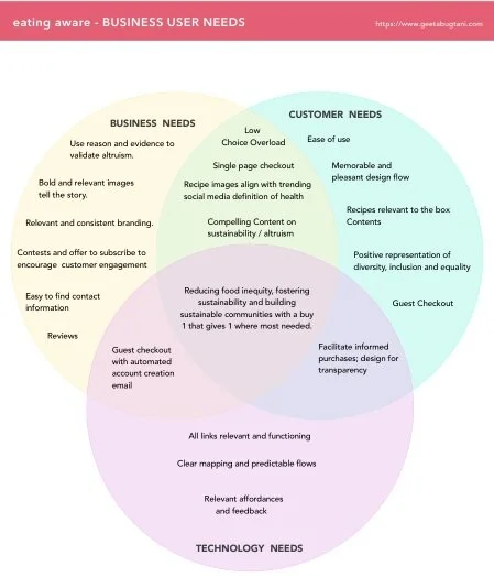


We are supporting local farms and building communities with zero hunger by rescuing local mostly wonky produce, and delivering fresh in quantities for complete recipes.
Fresh, local, rescued produce; where each box purchased sponsors a free box for a family in a food desert. Social justice, food equity, zero waste, and building a strong domestic farm to fork supply chain is our differentiation strategy. This clearly positions our product and service over our competitors strategy of customization with limited functionality. The user has expressed a clear interest in diversity, inclusion and equality, and factual accounts of their dismal experience with produce box services; we are serving their needs and thereby ending hunger one box at a time.
Business Model
Ideate

I revisited the ramp up, the design must haves and the logic defined by user flows to plan and build out pages with content relevant to my persona’s wants. I kept the design airy and the textual content succinct. Following is the Sketch link to view boards:
Medium Fidelity Wireframes
Branding &Visual Design
I pieced together wonky images and to get a feel for a color story. The competitors were unable to deliver on their basic brand promise; misshapen and fresh. This irony inspired the brand name:
Oddly Fresh


Circling back
I ran the brand name “Oddly Fresh” by my user demographic. They were unimpressed and remarked, “It’s normal for produce to be fresh, not odd”. I had perhaps tried to lighten the feel and overreached. What had inspired this project?
Awareness of the benefits of eating fresh and healthy
eating aware


UI kit


High Fidelity Wireframes
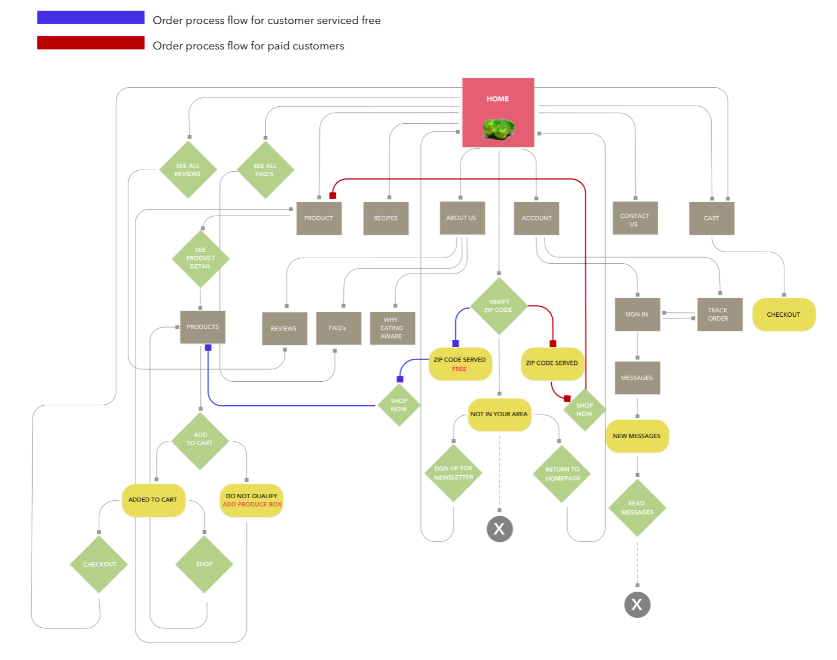
Two flows have been prototyped; one for the paying customer and another for the customer in food deserts who is serviced free of charge.
Prototype
Customer serviced free
Paying customer
Test & Validate
User Demographics
Participants
Average age
Gender
Children
Pets
Annual Income
Spending Habits
5
35
Equal representation
50% of the participants have children
All participants have pets
$150K - $13M
Spending habits
Press play twice
Test Results
The visual statement of wonky vegetables is lost in overused waveforms
Sage tones felt chalky, not fresh
The Gift card designs page was too busy, fonts were distracting, the design for offer to view details came across like a commitment to buy
One “special purchase” had three different design layouts, elements and messages
Too many buttons; links would work better for “learn more”
The pop-ups confirming serviced zip codes looked sad.
“Return to Homepage” button on pop-up is unnecessary
The recipe module was well received
User would not send a produce box as a gift without first trying it herself as her past experience with such services has not been pleasant; therefore having a gift card option on home page is contextually irrelevant
Flows are not intuitive; explained further in video below:
The fresh bright tones of the vegetables popped when I cut back on the use of chalky sage
Allowed the product / freshness of produce center stage by cutting back on geometric design elements
Reduced the distraction caused by engagement opportunities as this was not relevant for phase 1
Revisited all buttons and replaced with links where relevant
Reworked the gift card page design and images to be visually clean
Revisited all flows and made them more intuitive.
Priority Changes Implemented
Pop-up Before
The zip code verification pop-up has a menu which is not relevant at this stage of design. The pop-up is a chalky dolor and amidst the organic forms of blobs and waves the shape of wonky produce is lost. The option to return to homepage can result in a lost sale.
Pop-up After
Sets the correct expectations of wonky produce, is bright and welcoming. with a single relevant CTA. Removal of the return to homepage option increasing chances of shopping.
Before & After Screens


The vibrant vegetables are lost amidst excessive design with use of sage, waveforms and offers; all of which distract from a sale. Sharon’s story is not well communicated and yet the design elements / size over power the product which is directly under. The invitation to visit the gift card page is misleading as it appears to be a commitment to buy.

I added wonky vegetable to increase incentive to rescue , reduced the saturation and use of sage and waves, corrected the gift card module, made a video of Sharon’s story and removed excessive offers. I believe elaborating on the story of a food desert resident will promote consumer empathy and dedication to the cause. After all why not buy from a source that eliminates hunger!

Homepage Before
Homepage After
eGift Card Before
The header is crowded and the design element of personalizing comes across as a commitment to buy. The fonts are difficult to read and three cards have a low contrast ratio.
I would like to call out the footer; it too lacks sufficient contrast, and the invitation to subscribe to newsletter is no more welcoming than Pepto Bismal.

eGift Card After
The header is clean, organic and contextual. Font weights and sizes have been corrected. Three cards have been redesigned, the addition of a brand color and its repetition make the page cohesive and lively.
The footer calls attention with a new organic form, the change in color brings a lively contrast.

Final Prototype
Users flows proved intuitive
Design patterns friendly and visually pleasing
Users expressed an interest and engaged with content after task completion
The presentation of Sharon’s story inspired discussions on waste
The one page checkout with cart was convenient
All participants said they would subscribe to change
They would like a FAQ’s section
All users were excited with the opportunity to eat healthy
They were attracted by “specials” and quite willing to pay out of pocket for pasta & bread
They went through content after task completion and shared it with friends
I had interviewed a group of individuals who did not have a regular job and their families did not get to eat much if the bread winner was unemployed for the day
Final Testing & Validation
Paying Customer Base
Customers Serviced Free


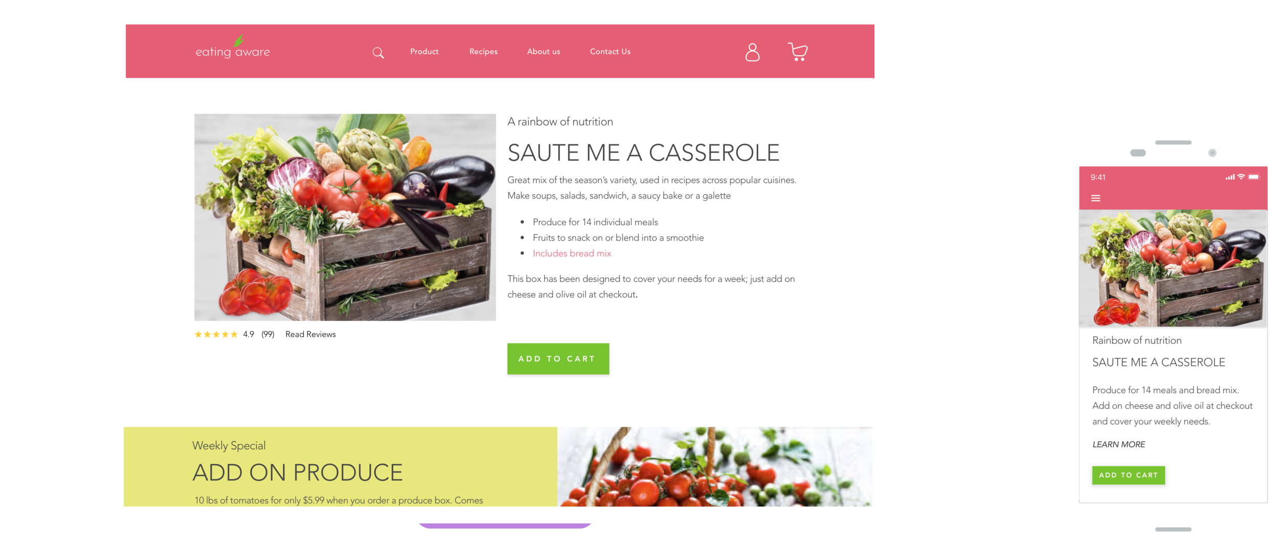
Final Select High Fidelity Screens
Desktop


Mobile
Next Steps
Allow social sign-in & checkout.
Assign FAQ’s a separate navigation category and elaborate
Build in affordance to send gift cards to multiple emails in one purchase
Add design features where pantry items can be shipped to zip codes not serviced by produce.
Replace all images with commissioned photography of wonky produce
Add tips on storage and recycling leftovers.
Build features to keep stock of produce on hand, suggest recipes, keep track of leftovers and reduce waste.
Final Prototype Videos
Serviced Free

Paying Customer
Please press play twice

Please press play twice
My battle with being different and colorful taught me color has to be relevant to product and the selection of a palette requires product input: a feature not offered by color generators. Predictable design patterns and flows are based off sound logic or established as sound logic.
UXUI creativity is the problem solving part of the process, built on excellent research and problem solving. However, UXUI is NOT art or visual design; and as such, we are merely advocates of our user’s needs and design patterns; followers and implementers (rarely makers) and our ultimate goals are to meet task achievements, and avoid dead ends. We are not the designers of unique experiences or in pursuit of the purest definition of creativity.
A “delivered to all doors” approach is just a start and cannot be isolated from the much required improvement in all forms of social justice; hunger has many faces.
What I Learnt
Are you eating aware?